Scrap PDX is a small creative reuse center that serves the community by reducing waste while stimulating creativity.
Every year, Scrap diverts tons of usable, creative material from the waste stream.
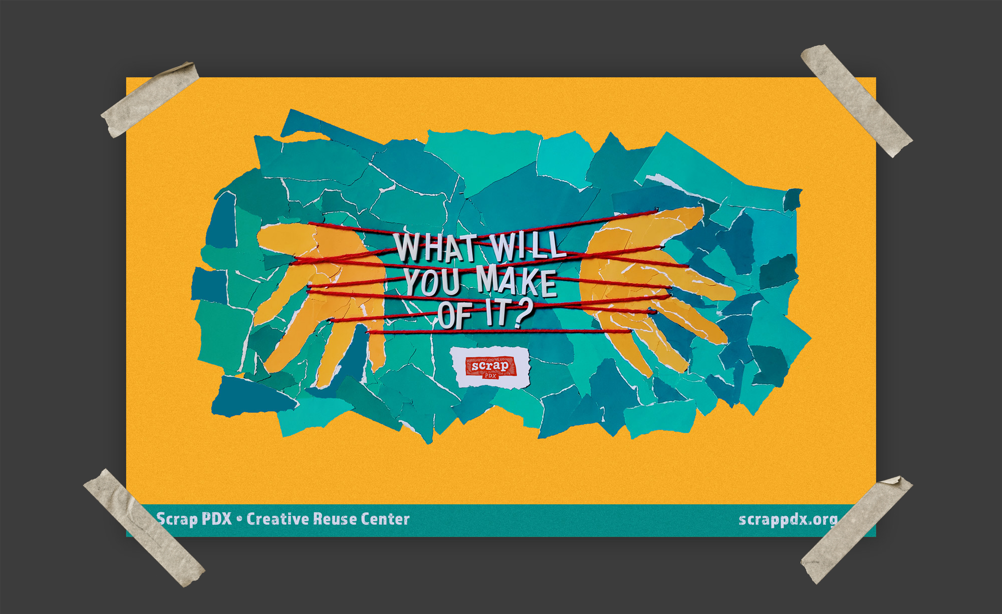
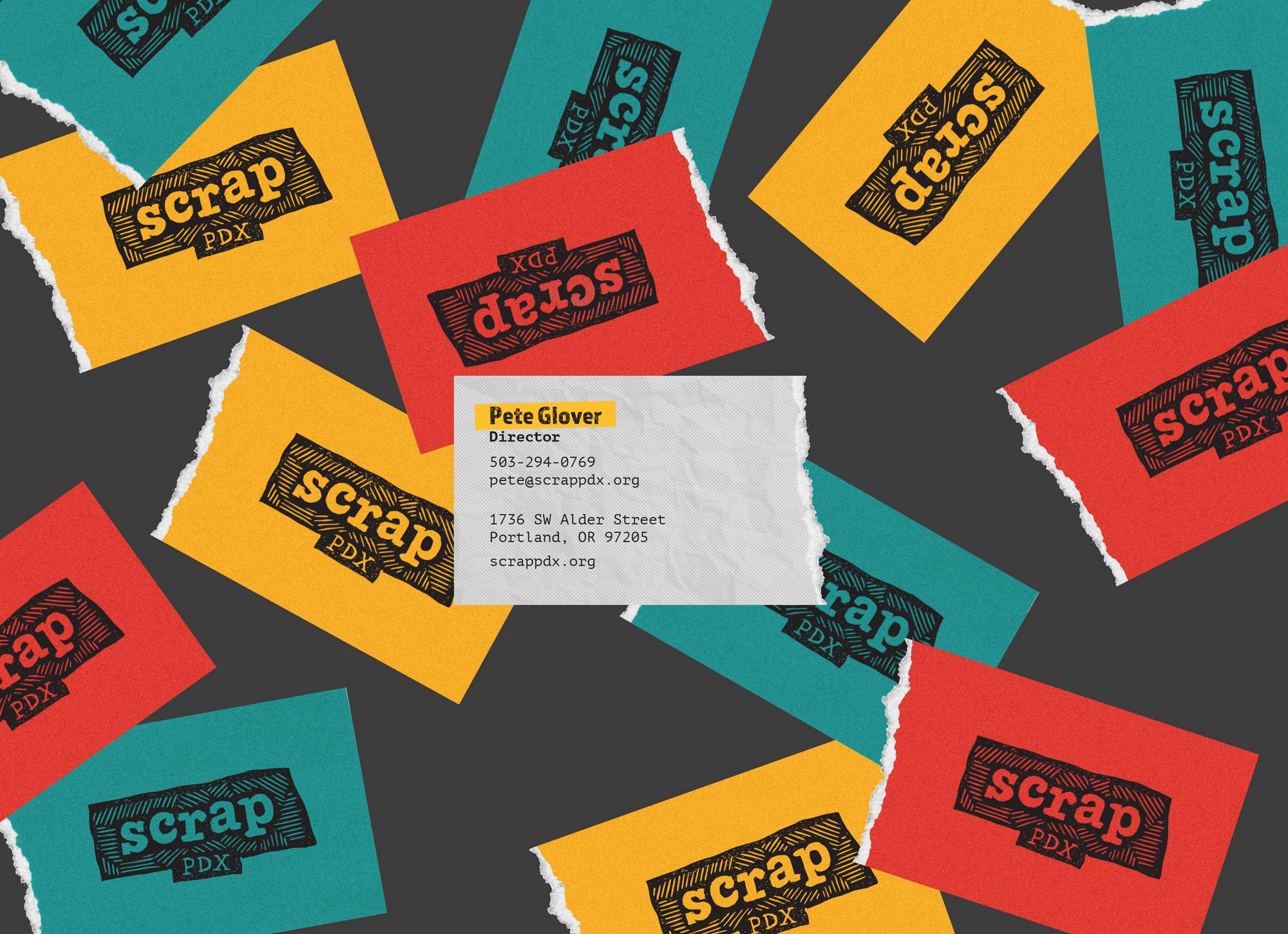
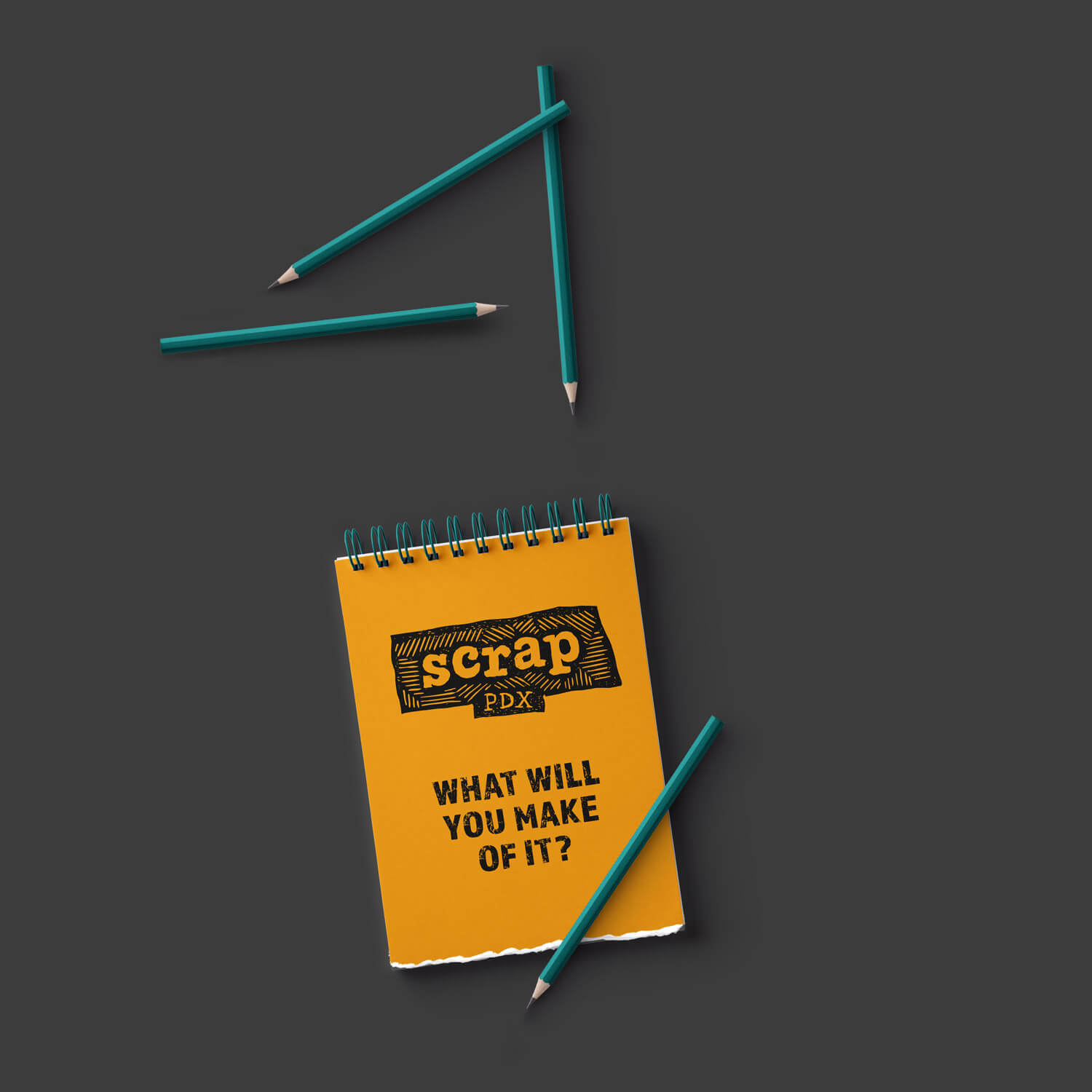
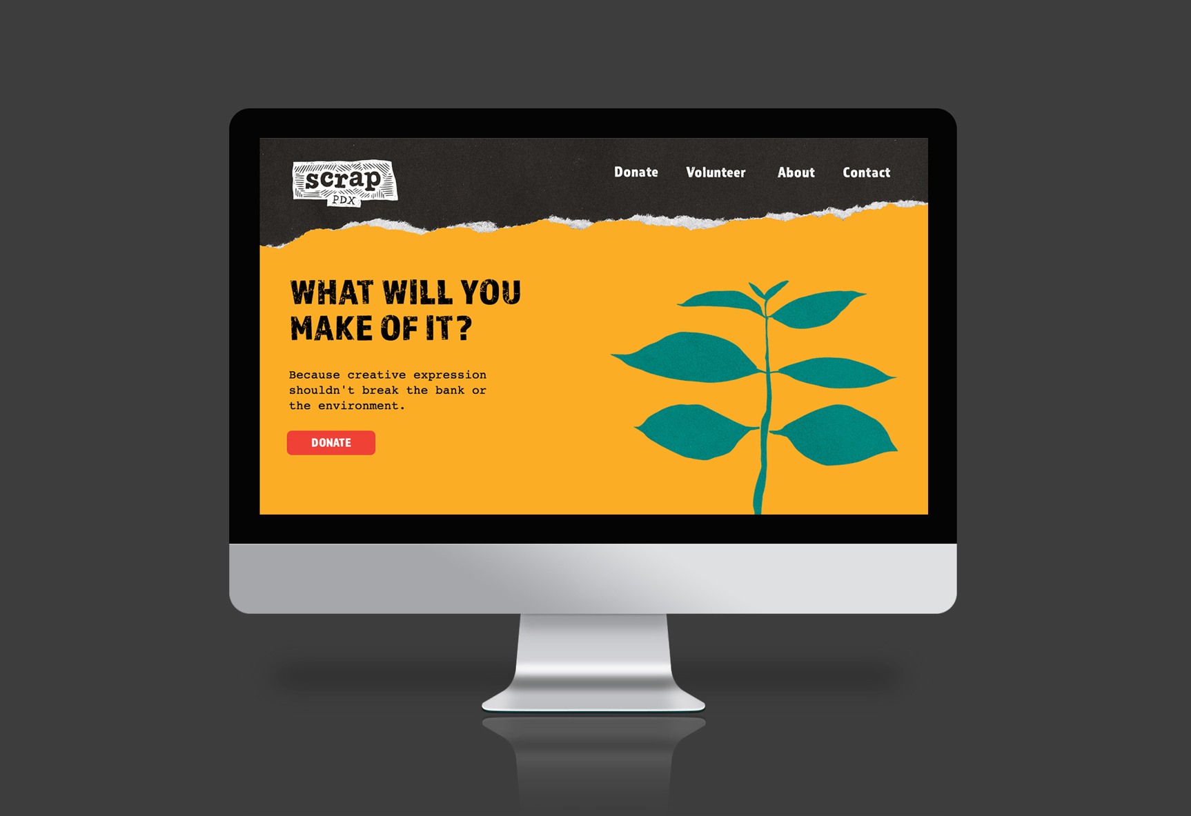
Scrap's visual Identity displays rough edges and textures that resemble homemade crafts.
The graphic elements that make up this brand intent to connect the audience with the experience of shopping at Scrap.
These business cards are not perfectly cut, instead, they are ripped on one side, highlighting the rough and random look of the items often found at Scrap.
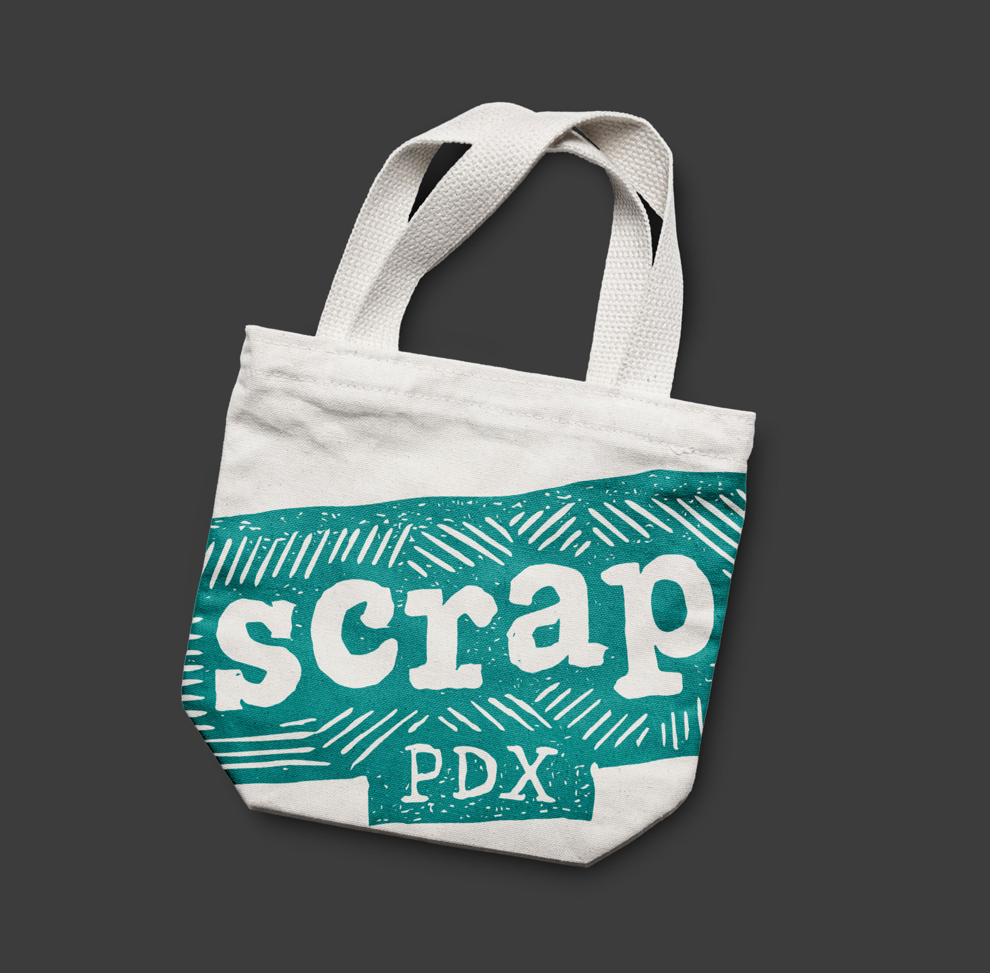
As promotional items, these giveaways imply reusability and display the costumer's pride of being part of what Scrap stands for.
The website features elements that emphasize the rough look and environmentally friendly mission of Scrap.
An advertisement piece can increase awareness of Scrap's presence. To reach the intended audience, this poster could be placed around art schools, art galleries, and places where creative people get together.